Event Drawing
Monthly Archives: November 2013
Montage
Montage is making a composite photograph by cutting and joining two or more photographs into an illusion of an unreal subject.
David Hockney – Boring in England (1937), David attended an art school in London. Soon after he moved to Los Angeles in the 1960’s. David didn’t start working on photography until the 1970’s creating photo collages.
Cubism: Characterized by the reduction and fragmentation of natural forms into abstract, often geometric structures usually rendered as a set of discrete planes.
Pablo Picasso was an artists who did cubism, one of them being Les Demoiselles d’Avignon.
Cubism and photo montages are similar because you use smaller pieces to create one big piece of art.
Find Your Thing Collage
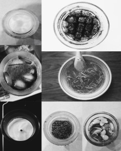
I wanted to be different on my find a something, so I did something no one would guess; items in a circular container. At first I was iffy about the idea but I took the pictures and it came out better than I expected. I made them black and white so people would focus on the items rather than the color.
Zombie Poster
After hearing a summary of the play, I decided to put together what I heard to make it creepy yet have the christmas concept. I started off with the background giving it a creepy factory theme then used the pictures I took of the people to add a scary christmas effect. The zombies are being out together by the workers or Santa’s helpers. The title just happened, I was not planning on doing the title like that but it came out good.
Spirit Week Collage
Still Life
Ghost Image
Halloween ! 2013
Article Project: Technology Message
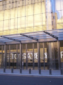
I read an article on technology and how Jenny Holzer projects messages through technology like electronic billboards, and big screens, buildings, etc.
As for my project, I was trying to rebuild that concept through using a television. I was trying to convey the message of technology and how it has a positive and negative. The positive is shown through all the new creations, phones, cameras, laptops, and the darkness represents how further technology goes. For the negative, the darkness represents how it could be hurting us, because we depend so much in it.I did like how it came out, I just wished I could have used a billboard or a nice building. I think it reflects it pretty well.


